The number of images taken in the world increases year after year. Many of them sink into insignificance in the depths of data carriers. But still they exist, the snapshots or even high-calibre, well-planned, well-composed photographs that are absolutely worth printing out in the best possible quality and hanging on the wall so that everyone who comes to visit can see them. Especially photographs from nature and landscapephotography come to life when printed on a large format and thus amaze the viewer. On the way from camera sensor to fine art pigment print on exclusive photo paper (or photo print behind acrylic, canvas etc.) lurk some pitfalls that I would like to explain in this blog post.
I will explain how to convert a digital image into a printed photo and what factors to consider. We will look at the role of the colour space and the resolution, which types of paper and Printer are best suited and how to prepare the image to achieve the best result. An interesting topic that, once you have gone through it and have your first own print in your hands, can lead to streams of enthusiasm.
Already when taking the picture, one should pay attention to a certain standard. Because according to the motto “shit in, shit out”, the end result can only be as good as the starting point, but not better. For this reason, I recommend, as is often the case, to take your photos in the RAW file format of your camera this is the only way to have the best control over colours, sharpness, etc. in image processing.
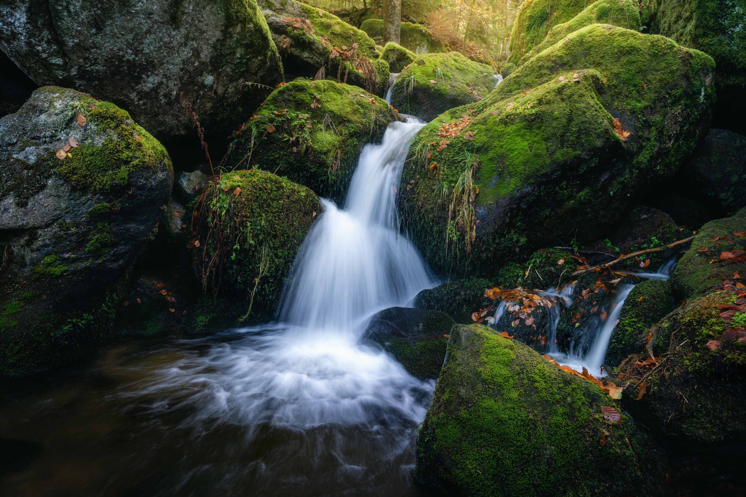
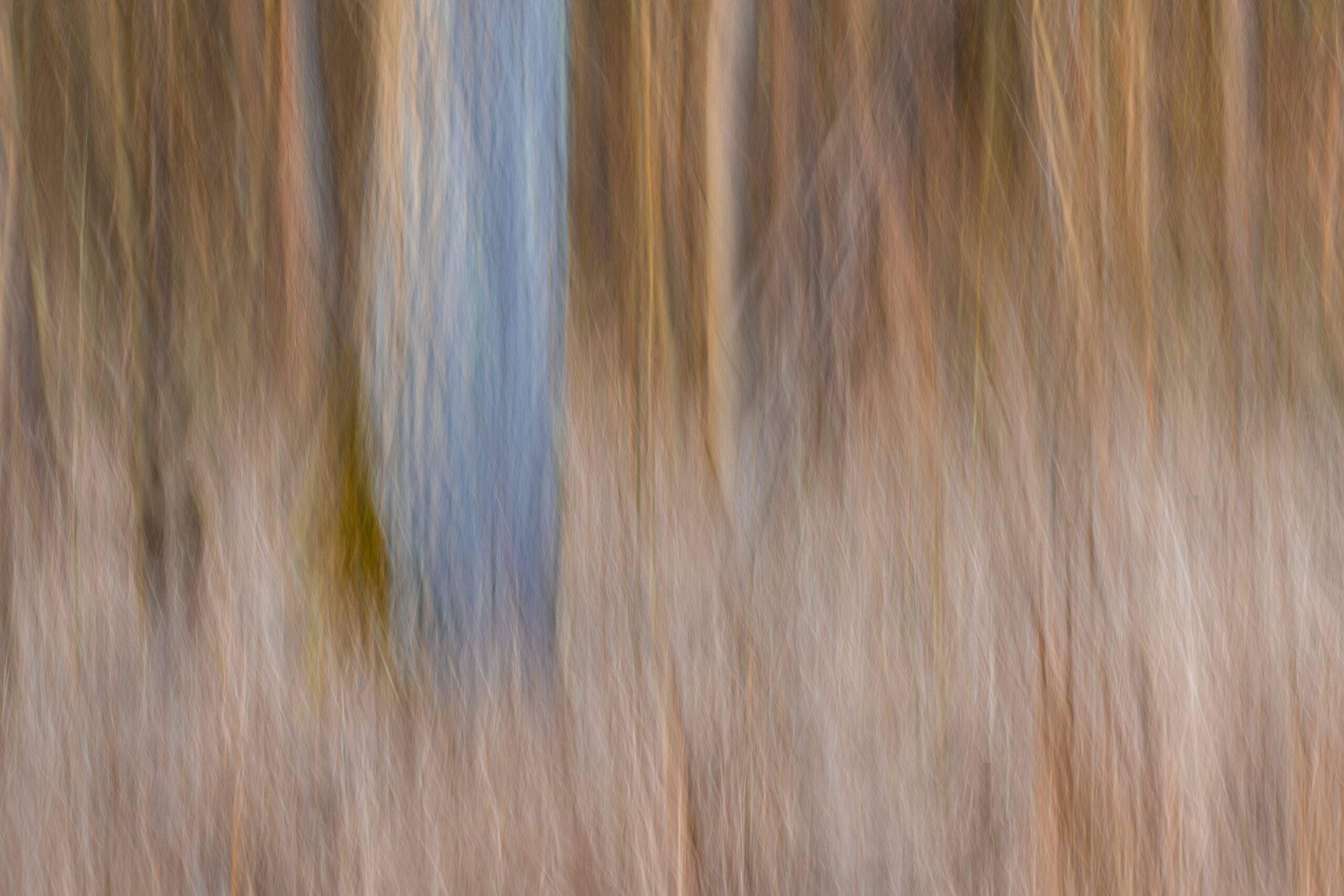
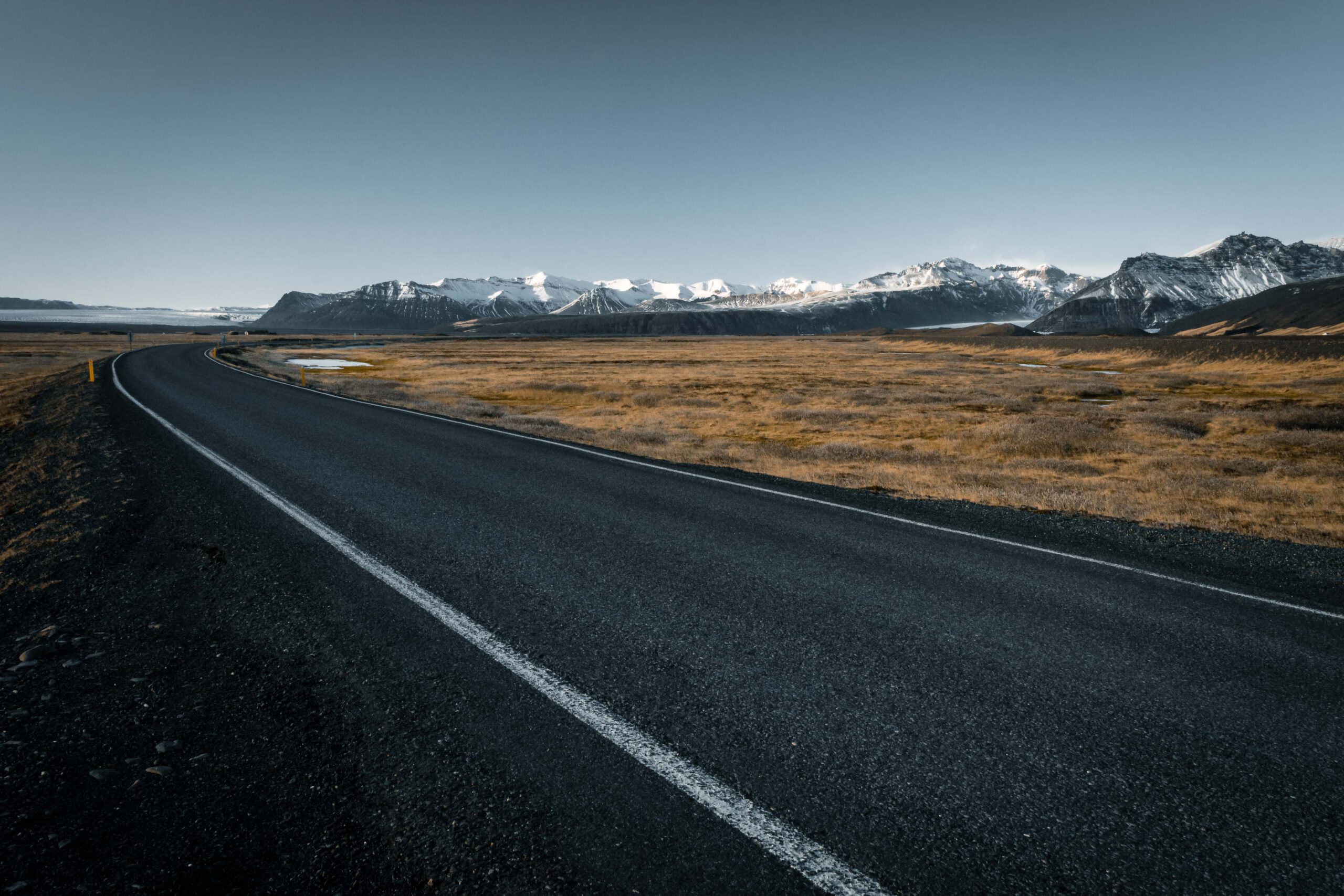
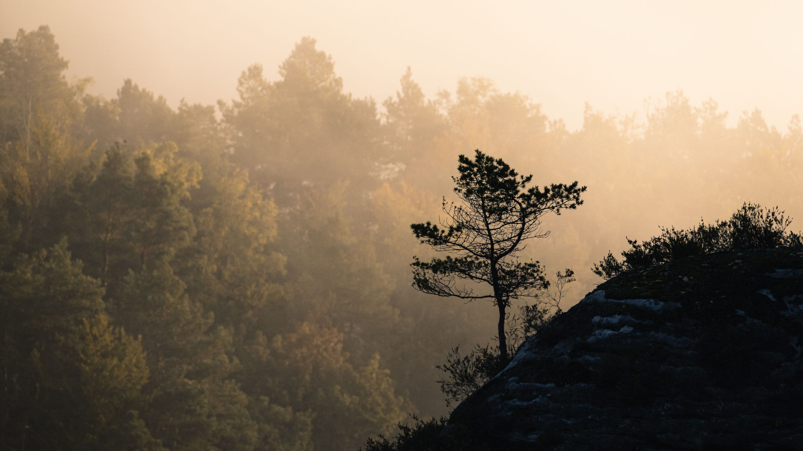
This and all other shots of this post you can request under “Prints” as an art print for your wall at home directly from me.
The two most important factors in converting a digital image into a printed photograph are colour space and resolution. The colour space refers to the number of colours that an image can represent. Humans have a certain colour space that they can see at all, shown as a coloured area in the following photo. The sRGB colour space was introduced as a standard some years ago to reduce or standardise colour shifts between different monitors and devices. Photoshop and Lightroom , as image editing software, work internally with ProPhotoRGB and thus the largest digital colour space, which partially exceeds human vision. AdobeRGB covers more colours than the sRGB colour space, and was actually developed to transfer files into the print colour space CMYK, as it covers all colours of the print. However, this is where the danger currently lurks.
Often the question for beginners is, do I shoot my RAWs in the sRGB or AdobeRGB colour space? Probably some will think AdobeRGB would be the better choice, as this colour space contains more colours, which is of course correct. But very few people have a monitor that can display these colours, so, to put it simply, they are processing colours that they cannot see and on which they have virtually no correct influence. This leads on the one hand to colour shifts when a device that can only display sRGB displays a file and on the other hand to “misinterpretation” as far as colours in the finished print are concerned. So in most cases it is better to use the standard RGB (sRGB). (You can find more on this topic here. It will be some time before AdobeRGB is more or less the new standard and you should orientate yourself on what your screen can display to you.
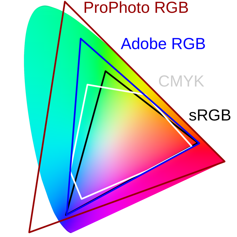
But even the sRGB colour space, which we mostly use for digital images, can represent many more colours than the CMYK colour space used for printing. Therefore, if you want to print your digital image, you need to convert it to the CMYK colour space to ensure that the colours are represented correctly. This is done with the help of the printer driver and icc profiles adapted to paper and printing inks. With them we can also simulate the print result on the monitor. More about this later. It is important to understand that in the RGB colour space, put simply, a black screen is made to glow with the help of the colours and in the CMYK colour space a white sheet is coloured.
Very briefly, a few words about resolution. Resolution refers to the number of pixels in an image. For good print quality, you should make sure that the resolution of the image is high enough. A resolution of 300 dpi (dots per inch) is ideal for printing. For comparison, an image for the web often has a resolution of just 72 dpi. If the resolution is too low, the image will look blurred and pixelated in print.
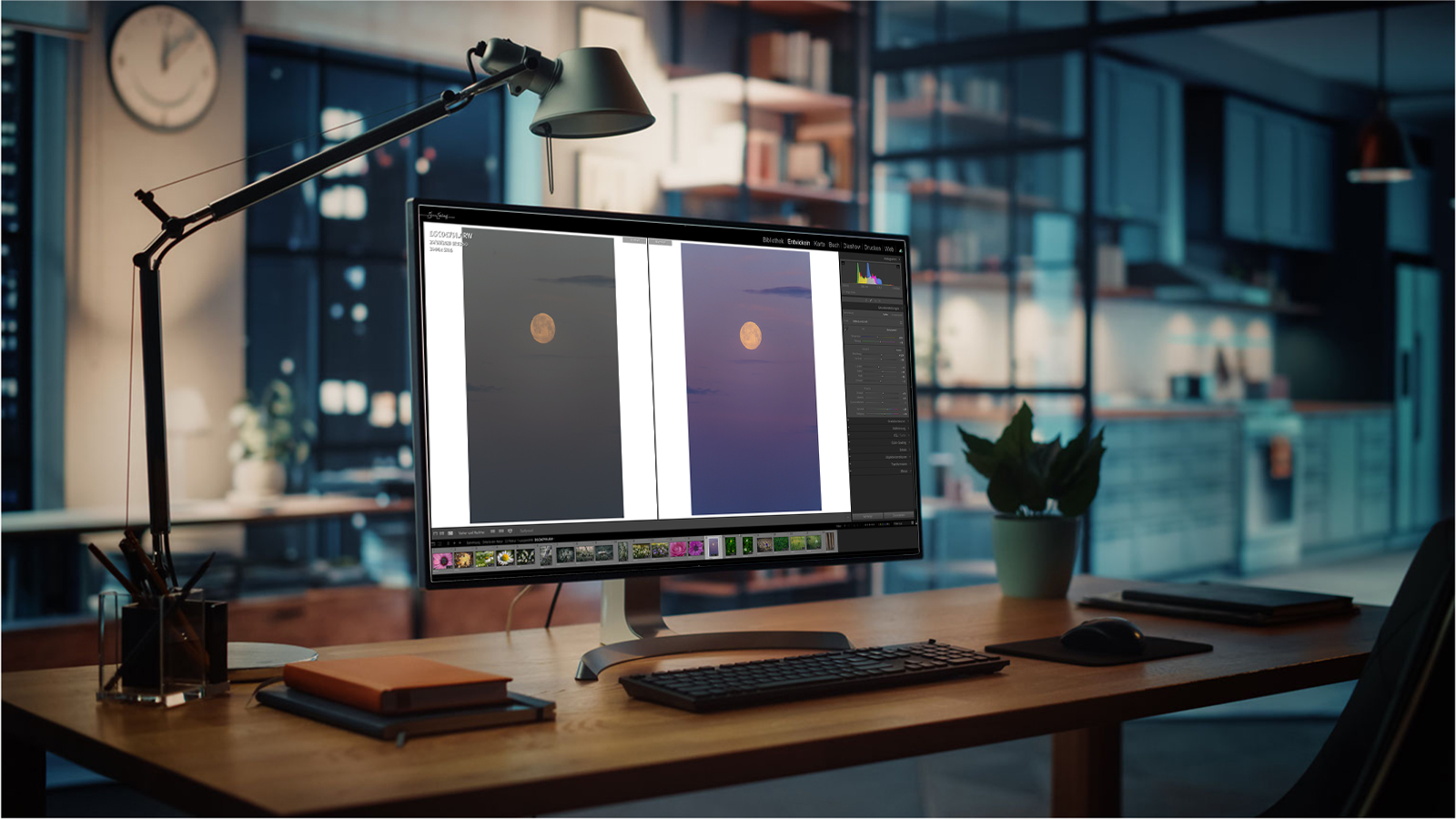
I hope you are still with me after the somewhat dry topic of colour space. Perhaps you will now realise why a good monitor that covers at least almost 100 % of the sRGB is necessary and why the calibration of this monitor is important.
To put it bluntly, if your screen is set too warm, you will probably process your images with too cool colours. If the monitor colours are set too cold, your image will have too warm colours. If your monitor is too bright, you will edit too dark, if your monitor is too dark, you will edit too bright, etc.
I myself use a Benq monitor with 100% sRGB colour coverage and calibrate it at least once a month with my Datacolor SpyderX Elite to ensure that my photos are displayed optimally on the web as they will be when printed later. When it comes to printing, please understand monitor calibration not as a gimmick but as a necessity.
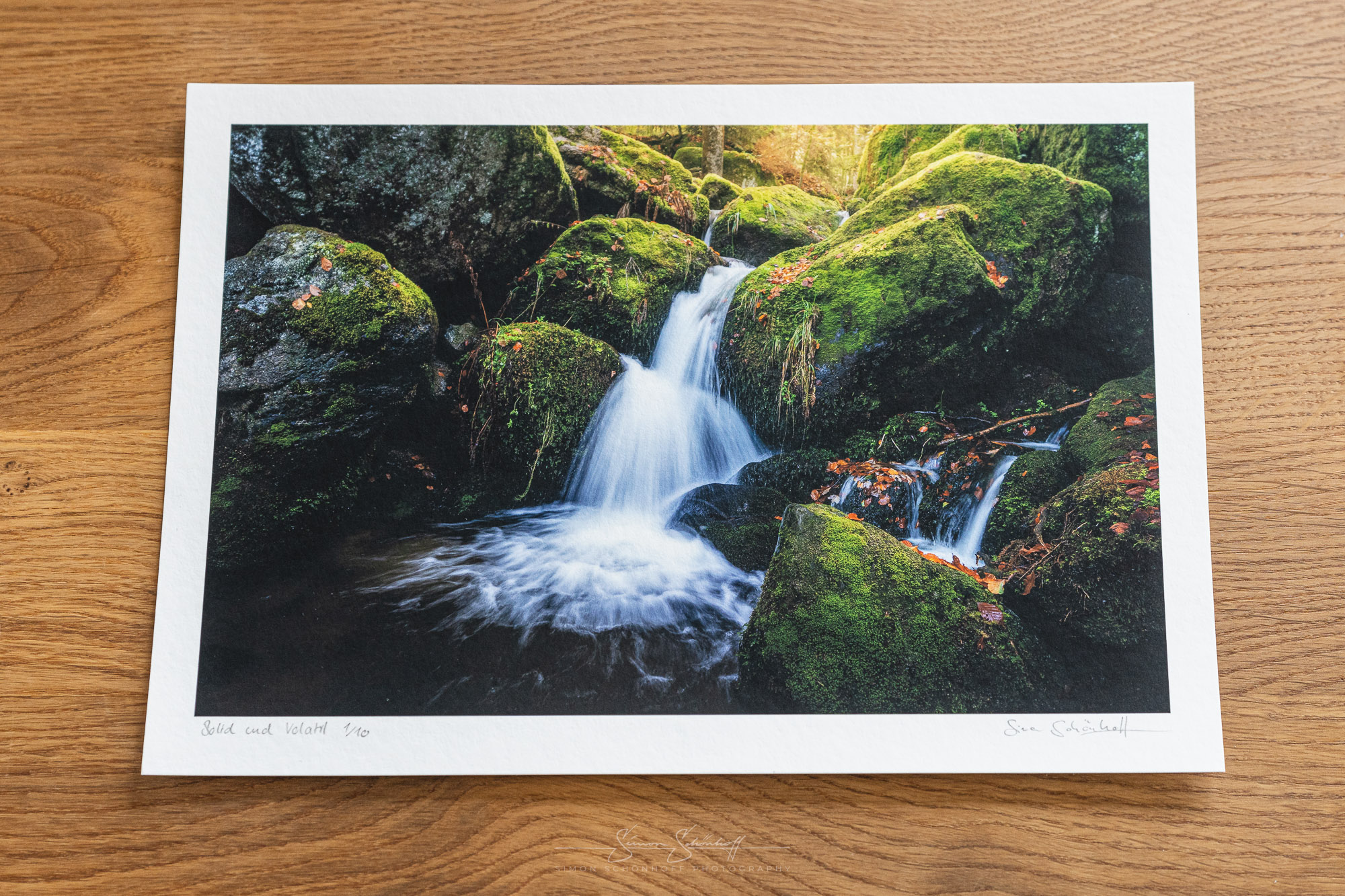
The paper you print the image on and the printer you use are also important factors. But even if you don’t print yourself, but have the prints made, make sure you only trust suppliers who also offer you icc profiles for the product. Otherwise, the result will not satisfy you, I am sure. With the help of icc-profiles you can simulate the print output and the influence of the paper colour in Lightroom (softproof in the development module) and Photoshop (Ctrl+Y or view/colour proof). You can then prepare the file a little for printing. I usually correct the exposure slightly upwards, increase the contrast and saturation if necessary. Depending on the paper/printer. Then the image processing for printing also fits.
An important point is to choose the right printer/printing service provider. An inkjet printer is ideal for printing photos as it offers high colour accuracy and good detail. Especially in the fine art printing sector, three manufacturers have emerged, namely Epson, HP and Canon, which offer a really convincing print quality with high quality pigment ink.
You should pay particular attention to print service providers. Do they offer icc profiles? Are they renowned photo labs with good ratings? It is not uncommon for the cheapest to be the ones with the lowest quality. So it’s sometimes worth spending an extra euro.
If you print yourself, be sure to follow the printer and paper manufacturer’s recommended settings. For my printer (an Epson SC-P900) and the Hahnemühle© papers used, there are coordinated icc profiles with recommended settings available for download. Proceed step by step and you will have a very good print result.
If you use a print service provider, download the icc profiles from their homepage and try to reproduce the print result on your own calibrated monitor. Then export a JPG or TIFF with the adjusted settings for printing by the service provider.
When printing from Photoshop (which I recommend), I always bring the file into the vertical arrangement beforehand, as the printer also feeds the paper in this way. This way you have the least problems with incorrect cropping, alignment etc. I adjust the image size in advance to the desired final result and then go to the print menu. Now it is important that the colour handling is set to colour management by Photoshop and the correct printer profile (icc) is selected. Render priority should be set to relative colourimetric. This is used to crop and adjust colours that cannot be printed. Select the correct paper size and print quality in the printer settings and start printing.
The subject of paper (and, indeed, other print media) is a big one where, on the one hand, personal preferences matter, but on the other hand, a whole world of its own emerges when you delve deeper into it. First and foremost, of course, it is the artist who uses the chosen paper to emphasise the message of his or her work and the character of the motif. Glossy or matt paper is suitable for printing photos. Each type of paper has its own advantages and disadvantages, these can be black and white values, different surface structures, but also the composition of the materials and sustainability is a topic that is increasingly coming into focus, especially among nature photographers. And it is important to choose the right paper for the desired result.
The steps as a short checklist:
Before you print the image, make sure you follow these steps step-by-step to ensure that your end result is satisfactory.
It can seem a little complicated at first, because printing digital images requires a certain amount of preparation and knowledge about colour space, resolution, paper and printer. However, if you take these factors into account and follow a step-by-step approach, you can be sure that your high-quality printed photos will look as good as they do on screen.
If you have any additions or if I have forgotten something, please write them in the comments. Also feel free to write me if you want me to explain the whole process in a video.